08 March 2018

Sailor, Even Worse

First, the news:

Sailor has just launched a new line of inks by the name of Ink Studio.

This is a collection of 100 colors, bottled in 20 ml inkwells. The price, JPY 1200, plus tax. The ink identification is now just a three digit number.


100 new inks with very poetic names. Sailor strikes again.

The package includes the text “dye ink” and these inks are likely to be variations of the well-known Jentle/Shikiori type.

JPY 1200 per 20 ml means JPY 60/ml.


20 ml inkwells for JPY 1200, plus tax.

Now, my personal coment:

Really?

Now Sailor becomes even more expensive (::1::, ::2::) while offering the supposed benefit of a palette of 100 colors. However, I grant Sailor the realization that nowadays the variety in the palette is more desirable than the actual amount of ink. And 50 ml inkwells might be too big at this time and age.


The catalog of colors together with their reference numbers. 100 colors, 100!

But JPY 60/ml is very expensive.

Really!


Conway-Stewart Dinkie 550 – Pelikan 4001 Royal Blue

Bruno Taut
Nakano, March 7th 2018
etiquetas: Sailor, tinta, mercado

05 March 2018

Corporate Edition

The 95th anniversary of Pilot in 2013 saw the resurrection of the Elite pen in pocket size—a very popular model in the 1970s. This contemporary revision, by the name of Elite 95s (::1::, ::2::), was launched in June of 2013, and Pilot had the goal of selling 8000 units during the first year. It seems that the goal was achieved as the model make to the regular catalog, where we can find it 5 years later.


Old (1970s) Pilot Elite pocket pens with inset nibs.

The pen itself is a cartridge-converter with inset nib made of 14 K gold in three different points: EF, F, and M. Two different finishes exist—an all black pen, and a burgundy unit with a metallic finish cap. On both cases, the decoration is gold plated.


The two public models of the Elite 95s, released in June of 2013.

But, is this all? No, there is a third version of the Elite 95s. A version that was never available in the market—a corporate edition made for the shareholders of Pilot Corporation in 2015. These "high-end" writing tools are presents offered to those owning more than 1000 shares of the company, which as of today, March 2018, is worth more than JPY 5,000,000 (over JPY 5000/share). For those owning between 100 and 1000 shares, the gift is a more boring "practical writing set" composed mostly of ball-pens, brushes and markers. These contents and their conditions can change every fiscal year. in fact, at the time of the release of this blue Elite 95, the requirement was lower--just 500 shares were needed for a "high-end writing tool".


An unusual Elite 95s--the corporate edition.

This secret pen shares the cap with the dark red version, but its body color is dark blue. The package included a 15 ml inkwell of Tsuki-yo ink of the Iroshizuku line of inks. By the way, the box containing pen and ink is that of the initial release of the Iroshizuku Mini inkwells.


The boxed set.


The whole collection of Pilot Elite 95s. The rarity and the regulars.

Needless to say, this private blue Elite 95s is nothing but an anecdote when compared to the black and red public releases. But collectors love rarities.


Conway-Stewart Dinkie 550 – Pelikan 4001 Royal Blue

Bruno Taut
Nakano, March 5th 2018
etiquetas: Pilot

26 February 2018

An Unusual Flat-top

The Custom 74 is the workhorse of Pilot in the very competitive range of pens around JPY 10000. This is the entry level to more luxurious tools and the big three Japanese pen companies play hard on this turf.

This particular model, the Custom 74 is, in a nutshell, a torpedo-shaped pen, with golden accents, a 14 K gold nib in size #5 and 11 points available. The filling system, needless to say, are cartridges and converters. This model came into existence in the year 74 of the Pilot era, i. e. 1992, and it is still manufactured nowadays (2018).

Then, what is the pen shown on the following picture?


A Pilot flat-top with golden accents...

It is a flat-top Custom 74. But this variation was never in the market. This pen is a private edition prepared for the share holders of the company, Pilot Corporation, in 1993.

This version is, in essence, identical to the regular Custom 74 save for the detail of the ending domes on cap and barrel. And all the parts are interchangeable.


The regular Custom 74 (top) and the private version made for the share holders of the company.

Years later, in 2009, Pilot launched the model Custom Heritage 91—a flat-top pen with rhodiated decoration, 14 K size #5 nibs (only 9 points available)… Almost a flat-top Custom 74, save for the very different clip.


From top to bottom, regular Custom 74, flat-top version of the Custom 74, and Custom Heritage 91. All of them carry the size #5 nib in 14 K gold.

These are the dimensions of these three pens:

.Custom 74.

.Custom 74 flat-top. .Custom Heritage 91.
Length closed (mm) 143 137 137.5
Length open (mm) 125 123 122.5
Length posted (mm) 160 156 156
Diameter (mm) 14.6 14.6 14.6
Weight, dry (g), with CON-70 21.4 21.8 21.4

The flat-top Custom 74 implements a “coarse” nib –a 3B point--, and I suspect that this was the only option for all those share-holders of Pilot’s. At least, the few units of this pen I have seen all carry this very broad point.


The "coarse" nib in size #5 implemented on the flat-top Custom 74.


Platinum pocket pen, Yamada Seisakusho – KWZ Brown #2

Bruno Taut
Nakano, February 26th 2018
etiquetas: Pilot

19 February 2018

Ink Price Evolution (Japan 2005-2018)

Official numbers say that the Japanese economy has been stagnated for a very long time. Prices in Japan, for instance, are remarkably stable. My favorite example is that along my more than 10 years in this country, public transportation in Tokyo has not changed their prices save for the sales tax increase in April of 2014.

But, is that the whole story? What about the fountain pen world?

Japanese pen companies have kept prices of hardware (i. e. pens) very stable in the last, say, 20 years. If fact, the traditional way of increasing the prices is to phase out some model only to be replaced by a new one at a higher price. A variation of this is what Platinum is doing with the 3776 series, whose recent variations are significantly more expensive than the basic version for nothing else than a color change or a semi transparent body.

In the field of inks, though, things are different. Just recently, Sailor rebranded its traditional line of “Jentle” inks as “Shikiori”, and reduced the inkwell capacity while keeping the original price of JPY 1000. This change represented a price hike of a 2.5 factor (150% increase). And this is not the first drastic rise in Sailor ink prices: in 2009, the same 50 ml inkwell went from JPY 600 to JPY 1000 (67% increase). We can see these price variations on the following graph:


Evolution of the prices of Sailor inks in JPY/ml according to MSRP in Japan. "Pigmented" inks refers to Kiwaguro and Seiboku inks, and does not include the (also pigmented) Storia inks. The line labeled as "Original Inks" corresponds to the typical price of Sailor-made inks for some stationers in Japan, but not for all of them.

And what about the other two main manufacturers?

Platinum inks showed only one inflationary moment in January of 2014 when the basic line of inks (black, blue-black and red) went from JPY 13.3/ml to JPY 20/ml. However, in the last 12 years, Platinum has created three new lines of inks –pigmented inks, Mix Free and Classic Inks— whose prices are much higher than the inks present at the time of their launching.


Evolution of the prices of Platinum inks in JPY/ml according to MSRP in Japan. Those inks labeled as "Iron Gall (Classic)" do not include the usual blue-black ink, which follows an iron-gall formulation.

Something similar could be said about Pilot inks. In 2007, Pilot launched the Iroshizuku line with a price that was (and still is) more than twice that of the regular line (black, blue-black, blue and red). But at the same time, along these past 12 years, Pilot has not increased the price of any of their inks.


Evolution of the prices of Pilot inks in JPY/ml according to MSRP in Japan. The lines of 30, 70 and 350 ml correspond to the regular line of Pilot inks: black, blue-black, blue and red. Re Iroshizuku inks, there is another presentation of them (Iroshizuku Mini) for JPY 47/ml.

It is difficult to judge which of these companies has higher prices in their inks. The answer depends on the use each of us might make of the different lines of inks or, alternatively, on the balanced average of the ink sales of each company.

Nevertheless, it is hard to avoid the conclusion that Sailor inks are, as of now, the most expensive of the main Japanese companies. The latest move, rebranding Jentle inks as Shikiori increasing their princes 150%, is too blunt and very difficult to justify.

But only the market will decide…

NOTE: The prices mentioned on this text are those reflected on the catalogs of the companies (MSRP) in Japanese Yen (JPY), in Japan, before taxes. Sales tax in Japan are currently 8%, and were 5% before April of 2014.


Ban-ei, wide ring with Henckel nib – Noodler’s Zhivago

Bruno Taut
Nakano, February 18th 2018
etiquetas: tinta, mercado, Sailor, Platinum, Pilot

08 February 2018

Inner Tube System

To the traditional eyedropper way of inking pens, Japanese companies added a mechanism to seal the ink deposit when not in use. A mechanism… or several of them.

The better known of them is the Japanese eyedropper, inki-dome system, although the original invention belonged to Onoto (De la Rue). Another such system is the hoshiawase (star system) invented by Pilot in the early 1920s. But there is more.


A Pilot from around 1920, if not before.

Prior to the system of the stars, Pilot entered the market –as a late comer in the Japanese context— with another system: the naikan shiki (内管式), or inner tube system. This consists of a modified screw –made of ebonite— attached to the section of the pen. By tightening or losing up that screw, the ink flow could be interrupted or open through the internal channels in that screw. The obvious inconvenient was the need to open the pen –the ink deposit— to operate this ink-stained screw. However, this system was effective in sealing the ink deposit.


Pilot developed and marketed this system probably trying to offer a novelty in a market already mature, with two very active pen companies –SSS and Nobuo Ito’s Swan–, and a number of imports from Europe and the US. The naikan shiki was short lived: only a couple of years around 1920.

As for the rest, this eyedropper pen is made of chased ebonite and implements a size 2 nib made of 14 K gold, although it might not be the original nib of this pen. The clip this particular unit sports is a later addition.


On the nib, the inscription says "14 KT GOLD / "PILOT" / < 2 > / MADE IN / JAPAN". However, the style of the inscription is probably too new, thus showing it is a replacement nib. On the text entitled N. M & Co. we can see a similar pen whose nib carries a much simpler engraving.

These are the dimensions of the pen:

Length closed: 139 mm
Length open: 131 mm
Length posted: 179 mm
Diameter: 12 mm
Weight (dry): 17.4 g


On the chased barrel, '"PILOT" / FOUNTAIN PEN / N. M. & Co.'. The company logo is on the left hand side. It shows the well-known lifebuoy encircling an N.


On the barrel end, a mysterious inscription: "P3CH". We had already seen it on another Pilot pen of the time.

Not all innovations work… However, the Japanese industry has never been shy to try different technical solutions on nibs and filling systems.

But short lived systems like this make the day of many a collector.

And on my side, I must add a correction to an old Chronicle.


My thanks to Mr. Sugimoto and Mr. Furuya.


Romillo Nervión – Sailor Blue Iron

Bruno Taut
Nakano, February 7th 2018
etiquetas: Pilot, soluciones técnicas

29 January 2018

Belage Music

Yet another music nib

A number of three-tined music nibs have appeared on these pages. With the exceptions of a magnificent Waterman’s size 4 and of a bespoke Montblanc modern nib, all were made in Japan after the War. Those music nibs are, in general, quite unassuming and they are associated to usual workhorses and not to luxurious models with lavish decoration or exotic materials. So, regular pens for regular use receive –and received— some of the most exciting nibs (and I am not only meaning mucis nibs).


A collection of music nibs made in Japan.

The Belage was a model Platinum launched in 1979. It was a cartridge converter pen with a wing-flow nib made of steel and of gold. Its design was very clean—basically a continuous steel cylinder from cap to barrel with a narrow plastic tail where the cap could be attached for posting. This design received the “Good Design Award” of the Ministry of International Trade and Industry of Japan.


Three different Platinum Belage. Older on top. Note the plastic tail on the two older units.

However, later versions of the pen had this clean design changed. Now, the barrel is slightly tapered and the cap posts directly on it, with no need of the narrower tail present on the original model.


The newer Belage.

This newer version was also smaller than the original—shorter, thinner, lighter. And its nib is also smaller in dimensions. It is still a wing-flow nib—only smaller. But the point today is that there were three-tined music nibs on these Belage pens. On this case, it is made of 14 K gold.


Front...

... back...

... and inside. Note the two ink channels in the feed.

These are the dimensions of this pen:

Length closed: 130.5 mm
Length open: 120.5 mm
Length posted: 143.0 mm
Diameter: 11.0 mm
Weight: 19.0 g (dry, with converter)

It is possible that the original Belage might have had a music nib. After all, we have already seen a wing-flow nib of that same size with three tines on a pocket pen from the mid 1970s.


This particular Belage with music nib was manufactured in 1998.


The Belage from 1998.


Platinum pocket pen, Yamada Seisakusho – KWZ Brown #2

Bruno Taut
Nakano, January 26th 2018
etiquetas: plumín, plumín musical, Platinum

22 January 2018

La Visconti Giapponese

Sometimes reading the pen is truly helpful. Well, mostly always.

At the past Madrid Pen Show I saw the pen on the photograph.


A Visconti. A Visconti?

On it, the signs on the box and on the clip did not really match with the pen itself. The logo of Visconti and the plain inscription on the clip contrasted with the basic structure of the pen—a Japanese eyedropper coated with red 
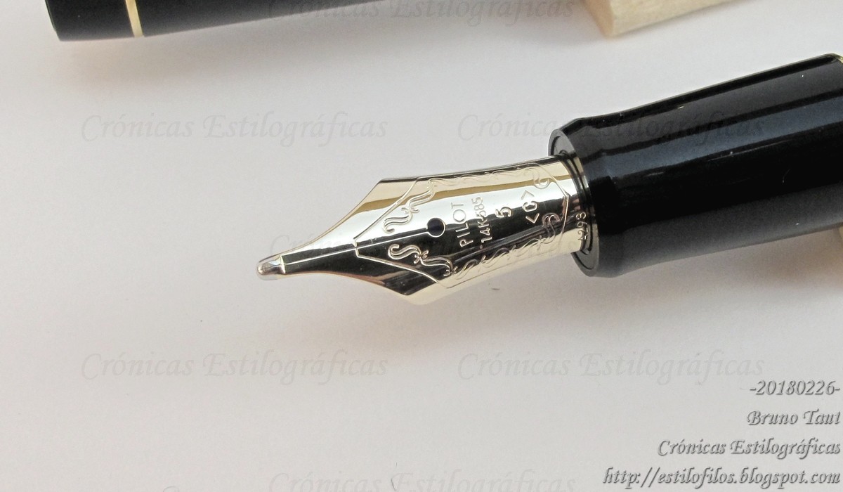
urushi. The nib, or rather its engraving, provided the final clue—it was signed by GK, Kabutogi Ginjiro, and the pen is, most likely, a Ban-ei made by Sakai Eisuke (lathe work), Kabutogi Ginjiro (nib), Tsuchida Shuichi (assembly), and Takahashi Kichitaro (urushi coating).


A Ban-ei pen with "nashiji" decoration. Nib signed by Kabutogi Ginjiro.

The additional literature included in the box describes, in Italian, the virtues of the “lacca giapponese” (urushi, of course) and speaks of its long history. It also includes instructions on how to fill and use the pen. Finally, it declares that the pen was part of a limited edition of 100 pens per year, but it does not disclose for how long. This particular unit was made in 1990 as it is numbered as 007/90... out of 100 pens made. (NOTE added on Sept. 2020: Some reports --see comments-- speak of serial numbers over 100 despite what the pen docs claim. So we should add some pinches of salt to those words despite coming from Visconti).


So, what was Visconti doing at that time? How come this very Japanese pen showed up under an Italian brand?

Visconti started its operation in 1988 and immediately contacted the Japanese lathe master Kato Kiyoshi, with whom Visconti would later collaborate in the fabrication of some models, including some versions of the Ragtime. And it is also at this time that Visconti contacted Sakai Eisuke and his team.

Apparently, there was at least two series of pens made by the Ban-ei group for the Italian brand. The first one, to which the pen shown today belongs, had a golden ring on the cap. As was mentioned before, Visconti released 100 units per year and there are records of at least two batches: 1990 and 1991. About the colors, some sources say that there were pens in ro-iro (black) urushi, but I am only aware of pens made in shu-urushi (red) as the one here shown. The clip inscriptions are either "VISCONTI" or "URUSHI".


The GK-signed nib of the Visconti Ban-ei. Note also the inscription on the clip: "VISCONTI".

A second series of Ban-ei pens were produced at a later date—1993 or 1995. On this occasion, the pens carried no rings and came in three colors: black (100 units), red (100 units), and green (50 units). The units I have seen have their clips engraved with the word "URUSHI", but there might be other other texts on them.

Some people speak of a third batch of pens previous to the first series here described. They could have been prototypes and test products later marketed by Visconti.

These are the dimensions of the pen I found at the Madrid Pen Show (2017) that belongs to the first series, and was made in 1990:

Length closed: 145 mm
Length open: 126.5 mm
Length posted: 176 mm
Diameter: 16.5 mm
Weight (dry): 25.3 g
Ink deposit: 3.3 ml


The cap ring carries the unit number of the series over the production year. This particular unit is the 007.90: number 7 (out of 100) made in 1990.

It is interesting to note that these Japanese Viscontis seem to predate those Danitrio-commissioned (::1::, ::2::) that are much better known. However, these Visconti pens remained essentially anonymous, as was customary on Ban-ei pens, and the Italian brand did not even declare where they had been made.


Of course!—we all know by now that GK was a magnificent Italian nibmeister… But reading the pen helps to know what you had on your hands beyond what labels and inscriptions might say.


Platinum 70th anniversary, green celluloid – Sailor Yama-dori

Bruno Taut
Nakano, January 17th 2018
labels: Ban-ei, Visconti, Danitrio, Italia, Japón, nibmeister Kabutogi Ginjiro, urushi